October 2025 - New Components
For this round of components, I looked at what we build every day, the boring stuff we rebuild over and over, and made reusable abstractions you can actually use.
These components work with every component library, Radix, Base UI, React Aria, you name it. Copy and paste to your projects.
- Spinner: An indicator to show a loading state.
- Kbd: Display a keyboard key or group of keys.
- Button Group: A group of buttons for actions and split buttons.
- Input Group: Input with icons, buttons, labels and more.
- Field: One component. All your forms.
- Item: Display lists of items, cards, and more.
- Empty: Use this one for empty states.
Spinner
Okay let's start with the easiest ones: Spinner and Kbd. Pretty basic. We all know what they do.
Here's how you render a spinner:
import { Spinner } from "@/components/ui/spinner"<Spinner />Here's what it looks like:
import { Spinner } from "@/components/ui/spinner"

export function SpinnerBasic() {
  return (
    <div className="flex flex-col items-center justify-center gap-8">
      <Spinner />
    </div>
  )
}
Here's what it looks like in a button:
import { Button } from "@/components/ui/button"
import { Spinner } from "@/components/ui/spinner"

export function SpinnerButton() {
  return (
    <div className="flex flex-col items-center gap-4">
      <Button disabled size="sm">
        <Spinner />
        Loading...
      </Button>
      <Button variant="outline" disabled size="sm">
        <Spinner />
        Please wait
      </Button>
      <Button variant="secondary" disabled size="sm">
        <Spinner />
        Processing
      </Button>
    </div>
  )
}
You can edit the code and replace it with your own spinner.
import { LoaderIcon } from "lucide-react"

import { cn } from "@/lib/utils"

function Spinner({ className, ...props }: React.ComponentProps<"svg">) {
  return (
    <LoaderIcon
      role="status"
      aria-label="Loading"
      className={cn("size-4 animate-spin", className)}
      {...props}
    />
  )
}

export function SpinnerCustom() {
  return (
    <div className="flex items-center gap-4">
      <Spinner />
    </div>
  )
}
Kbd
Kbd is a component that renders a keyboard key.
import { Kbd, KbdGroup } from "@/components/ui/kbd"<Kbd>Ctrl</Kbd>Use KbdGroup to group keyboard keys together.
<KbdGroup>
<Kbd>Ctrl</Kbd>
<Kbd>B</Kbd>
</KbdGroup>import { Kbd, KbdGroup } from "@/components/ui/kbd"
export function KbdDemo() {
return (
<div className="flex flex-col items-center gap-4">
<KbdGroup>
<Kbd>⌘</Kbd>
<Kbd>⇧</Kbd>
<Kbd>⌥</Kbd>
<Kbd>⌃</Kbd>
</KbdGroup>
<KbdGroup>
<Kbd>Ctrl</Kbd>
<span>+</span>
<Kbd>B</Kbd>
</KbdGroup>
</div>
)
}
You can add it to buttons, tooltips, input groups, and more.
Button Group
I got a lot of requests for this one: Button Group. It's a container that groups related buttons together with consistent styling. Great for action groups, split buttons, and more.
"use client"

import * as React from "react"
import {
  ArchiveIcon,
  ArrowLeftIcon,
  CalendarPlusIcon,
  ClockIcon,
  ListFilterPlusIcon,
  MailCheckIcon,
  MoreHorizontalIcon,
  TagIcon,
  Trash2Icon,
} from "lucide-react"

import { Button } from "@/components/ui/button"
import { ButtonGroup } from "@/components/ui/button-group"
import {
  DropdownMenu,
  DropdownMenuContent,
  DropdownMenuGroup,
  DropdownMenuItem,
  DropdownMenuRadioGroup,
  DropdownMenuRadioItem,
  DropdownMenuSeparator,
  DropdownMenuSub,
  DropdownMenuSubContent,
  DropdownMenuSubTrigger,
  DropdownMenuTrigger,
} from "@/components/ui/dropdown-menu"

export function ButtonGroupDemo() {
  const [label, setLabel] = React.useState("personal")

  return (
    <ButtonGroup>
      <ButtonGroup className="hidden sm:flex">
        <Button variant="outline" size="icon" aria-label="Go Back">
          <ArrowLeftIcon />
        </Button>
      </ButtonGroup>
      <ButtonGroup>
        <Button variant="outline">Archive</Button>
        <Button variant="outline">Report</Button>
      </ButtonGroup>
      <ButtonGroup>
        <Button variant="outline">Snooze</Button>
        <DropdownMenu>
          <DropdownMenuTrigger asChild>
            <Button variant="outline" size="icon" aria-label="More Options">
              <MoreHorizontalIcon />
            </Button>
          </DropdownMenuTrigger>
          <DropdownMenuContent align="end" className="w-52">
            <DropdownMenuGroup>
              <DropdownMenuItem>
                <MailCheckIcon />
                Mark as Read
              </DropdownMenuItem>
              <DropdownMenuItem>
                <ArchiveIcon />
                Archive
              </DropdownMenuItem>
            </DropdownMenuGroup>
            <DropdownMenuSeparator />
            <DropdownMenuGroup>
              <DropdownMenuItem>
                <ClockIcon />
                Snooze
              </DropdownMenuItem>
              <DropdownMenuItem>
                <CalendarPlusIcon />
                Add to Calendar
              </DropdownMenuItem>
              <DropdownMenuItem>
                <ListFilterPlusIcon />
                Add to List
              </DropdownMenuItem>
              <DropdownMenuSub>
                <DropdownMenuSubTrigger>
                  <TagIcon />
                  Label As...
                </DropdownMenuSubTrigger>
                <DropdownMenuSubContent>
                  <DropdownMenuRadioGroup
                    value={label}
                    onValueChange={setLabel}
                  >
                    <DropdownMenuRadioItem value="personal">
                      Personal
                    </DropdownMenuRadioItem>
                    <DropdownMenuRadioItem value="work">
                      Work
                    </DropdownMenuRadioItem>
                    <DropdownMenuRadioItem value="other">
                      Other
                    </DropdownMenuRadioItem>
                  </DropdownMenuRadioGroup>
                </DropdownMenuSubContent>
              </DropdownMenuSub>
            </DropdownMenuGroup>
            <DropdownMenuSeparator />
            <DropdownMenuGroup>
              <DropdownMenuItem variant="destructive">
                <Trash2Icon />
                Trash
              </DropdownMenuItem>
            </DropdownMenuGroup>
          </DropdownMenuContent>
        </DropdownMenu>
      </ButtonGroup>
    </ButtonGroup>
  )
}
Here's the code:
import { ButtonGroup } from "@/components/ui/button-group"<ButtonGroup>
<Button>Button 1</Button>
<Button>Button 2</Button>
</ButtonGroup>You can nest button groups to create more complex layouts with spacing.
<ButtonGroup>
<ButtonGroup>
<Button>Button 1</Button>
<Button>Button 2</Button>
</ButtonGroup>
<ButtonGroup>
<Button>Button 3</Button>
<Button>Button 4</Button>
</ButtonGroup>
</ButtonGroup>Use ButtonGroupSeparator to create split buttons. Classic dropdown pattern.
"use client"

import {
  AlertTriangleIcon,
  CheckIcon,
  ChevronDownIcon,
  CopyIcon,
  ShareIcon,
  TrashIcon,
  UserRoundXIcon,
  VolumeOffIcon,
} from "lucide-react"

import { Button } from "@/components/ui/button"
import { ButtonGroup } from "@/components/ui/button-group"
import {
  DropdownMenu,
  DropdownMenuContent,
  DropdownMenuGroup,
  DropdownMenuItem,
  DropdownMenuSeparator,
  DropdownMenuTrigger,
} from "@/components/ui/dropdown-menu"

export function ButtonGroupDropdown() {
  return (
    <ButtonGroup>
      <Button variant="outline">Follow</Button>
      <DropdownMenu>
        <DropdownMenuTrigger asChild>
          <Button variant="outline" className="!pl-2">
            <ChevronDownIcon />
          </Button>
        </DropdownMenuTrigger>
        <DropdownMenuContent align="end" className="[--radius:1rem]">
          <DropdownMenuGroup>
            <DropdownMenuItem>
              <VolumeOffIcon />
              Mute Conversation
            </DropdownMenuItem>
            <DropdownMenuItem>
              <CheckIcon />
              Mark as Read
            </DropdownMenuItem>
            <DropdownMenuItem>
              <AlertTriangleIcon />
              Report Conversation
            </DropdownMenuItem>
            <DropdownMenuItem>
              <UserRoundXIcon />
              Block User
            </DropdownMenuItem>
            <DropdownMenuItem>
              <ShareIcon />
              Share Conversation
            </DropdownMenuItem>
            <DropdownMenuItem>
              <CopyIcon />
              Copy Conversation
            </DropdownMenuItem>
          </DropdownMenuGroup>
          <DropdownMenuSeparator />
          <DropdownMenuGroup>
            <DropdownMenuItem variant="destructive">
              <TrashIcon />
              Delete Conversation
            </DropdownMenuItem>
          </DropdownMenuGroup>
        </DropdownMenuContent>
      </DropdownMenu>
    </ButtonGroup>
  )
}
You can also use it to add prefix or suffix buttons and text to inputs.
"use client"

import * as React from "react"
import { ArrowRightIcon } from "lucide-react"

import { Button } from "@/components/ui/button"
import { ButtonGroup } from "@/components/ui/button-group"
import { Input } from "@/components/ui/input"
import {
  Select,
  SelectContent,
  SelectItem,
  SelectTrigger,
} from "@/components/ui/select"

const CURRENCIES = [
  {
    value: "$",
    label: "US Dollar",
  },
  {
    value: "€",
    label: "Euro",
  },
  {
    value: "£",
    label: "British Pound",
  },
]

export function ButtonGroupSelect() {
  const [currency, setCurrency] = React.useState("$")

  return (
    <ButtonGroup>
      <ButtonGroup>
        <Select value={currency} onValueChange={setCurrency}>
          <SelectTrigger className="font-mono">{currency}</SelectTrigger>
          <SelectContent className="min-w-24">
            {CURRENCIES.map((currency) => (
              <SelectItem key={currency.value} value={currency.value}>
                {currency.value}{" "}
                <span className="text-muted-foreground">{currency.label}</span>
              </SelectItem>
            ))}
          </SelectContent>
        </Select>
        <Input placeholder="10.00" pattern="[0-9]*" />
      </ButtonGroup>
      <ButtonGroup>
        <Button aria-label="Send" size="icon" variant="outline">
          <ArrowRightIcon />
        </Button>
      </ButtonGroup>
    </ButtonGroup>
  )
}
<ButtonGroup>
<ButtonGroupText>Prefix</ButtonGroupText>
<Input placeholder="Type something here..." />
<Button>Button</Button>
</ButtonGroup>Input Group
Input Group lets you add icons, buttons, and more to your inputs. You know, all those little bits you always need around your inputs.
import {
InputGroup,
InputGroupAddon,
InputGroupInput,
} from "@/components/ui/input-group"<InputGroup>
<InputGroupInput placeholder="Search..." />
<InputGroupAddon>
<SearchIcon />
</InputGroupAddon>
</InputGroup>Here's a preview with icons:
import {
  CheckIcon,
  CreditCardIcon,
  InfoIcon,
  MailIcon,
  SearchIcon,
  StarIcon,
} from "lucide-react"

import {
  InputGroup,
  InputGroupAddon,
  InputGroupInput,
} from "@/components/ui/input-group"

export function InputGroupIcon() {
  return (
    <div className="grid w-full max-w-sm gap-6">
      <InputGroup>
        <InputGroupInput placeholder="Search..." />
        <InputGroupAddon>
          <SearchIcon />
        </InputGroupAddon>
      </InputGroup>
      <InputGroup>
        <InputGroupInput type="email" placeholder="Enter your email" />
        <InputGroupAddon>
          <MailIcon />
        </InputGroupAddon>
      </InputGroup>
      <InputGroup>
        <InputGroupInput placeholder="Card number" />
        <InputGroupAddon>
          <CreditCardIcon />
        </InputGroupAddon>
        <InputGroupAddon align="inline-end">
          <CheckIcon />
        </InputGroupAddon>
      </InputGroup>
      <InputGroup>
        <InputGroupInput placeholder="Card number" />
        <InputGroupAddon align="inline-end">
          <StarIcon />
          <InfoIcon />
        </InputGroupAddon>
      </InputGroup>
    </div>
  )
}
You can also add buttons to the input group.
"use client"

import * as React from "react"
import {
  IconCheck,
  IconCopy,
  IconInfoCircle,
  IconStar,
} from "@tabler/icons-react"

import { useCopyToClipboard } from "@/hooks/use-copy-to-clipboard"
import {
  InputGroup,
  InputGroupAddon,
  InputGroupButton,
  InputGroupInput,
} from "@/components/ui/input-group"
import {
  Popover,
  PopoverContent,
  PopoverTrigger,
} from "@/components/ui/popover"

export function InputGroupButtonExample() {
  const { copyToClipboard, isCopied } = useCopyToClipboard()
  const [isFavorite, setIsFavorite] = React.useState(false)

  return (
    <div className="grid w-full max-w-sm gap-6">
      <InputGroup>
        <InputGroupInput placeholder="https://x.com/shadcn" readOnly />
        <InputGroupAddon align="inline-end">
          <InputGroupButton
            aria-label="Copy"
            title="Copy"
            size="icon-xs"
            onClick={() => {
              copyToClipboard("https://x.com/shadcn")
            }}
          >
            {isCopied ? <IconCheck /> : <IconCopy />}
          </InputGroupButton>
        </InputGroupAddon>
      </InputGroup>
      <InputGroup className="[--radius:9999px]">
        <Popover>
          <PopoverTrigger asChild>
            <InputGroupAddon>
              <InputGroupButton variant="secondary" size="icon-xs">
                <IconInfoCircle />
              </InputGroupButton>
            </InputGroupAddon>
          </PopoverTrigger>
          <PopoverContent
            align="start"
            className="flex flex-col gap-1 rounded-xl text-sm"
          >
            <p className="font-medium">Your connection is not secure.</p>
            <p>You should not enter any sensitive information on this site.</p>
          </PopoverContent>
        </Popover>
        <InputGroupAddon className="text-muted-foreground pl-1.5">
          https://
        </InputGroupAddon>
        <InputGroupInput id="input-secure-19" />
        <InputGroupAddon align="inline-end">
          <InputGroupButton
            onClick={() => setIsFavorite(!isFavorite)}
            size="icon-xs"
          >
            <IconStar
              data-favorite={isFavorite}
              className="data-[favorite=true]:fill-blue-600 data-[favorite=true]:stroke-blue-600"
            />
          </InputGroupButton>
        </InputGroupAddon>
      </InputGroup>
      <InputGroup>
        <InputGroupInput placeholder="Type to search..." />
        <InputGroupAddon align="inline-end">
          <InputGroupButton variant="secondary">Search</InputGroupButton>
        </InputGroupAddon>
      </InputGroup>
    </div>
  )
}
Or text, labels, tooltips,...
import {
  InputGroup,
  InputGroupAddon,
  InputGroupInput,
  InputGroupText,
  InputGroupTextarea,
} from "@/components/ui/input-group"

export function InputGroupTextExample() {
  return (
    <div className="grid w-full max-w-sm gap-6">
      <InputGroup>
        <InputGroupAddon>
          <InputGroupText>$</InputGroupText>
        </InputGroupAddon>
        <InputGroupInput placeholder="0.00" />
        <InputGroupAddon align="inline-end">
          <InputGroupText>USD</InputGroupText>
        </InputGroupAddon>
      </InputGroup>
      <InputGroup>
        <InputGroupAddon>
          <InputGroupText>https://</InputGroupText>
        </InputGroupAddon>
        <InputGroupInput placeholder="example.com" className="!pl-0.5" />
        <InputGroupAddon align="inline-end">
          <InputGroupText>.com</InputGroupText>
        </InputGroupAddon>
      </InputGroup>
      <InputGroup>
        <InputGroupInput placeholder="Enter your username" />
        <InputGroupAddon align="inline-end">
          <InputGroupText>@company.com</InputGroupText>
        </InputGroupAddon>
      </InputGroup>
      <InputGroup>
        <InputGroupTextarea placeholder="Enter your message" />
        <InputGroupAddon align="block-end">
          <InputGroupText className="text-muted-foreground text-xs">
            120 characters left
          </InputGroupText>
        </InputGroupAddon>
      </InputGroup>
    </div>
  )
}
It also works with textareas so you can build really complex components with lots of knobs and dials or yet another prompt form.
import {
  IconBrandJavascript,
  IconCopy,
  IconCornerDownLeft,
  IconRefresh,
} from "@tabler/icons-react"

import {
  InputGroup,
  InputGroupAddon,
  InputGroupButton,
  InputGroupText,
  InputGroupTextarea,
} from "@/components/ui/input-group"

export function InputGroupTextareaExample() {
  return (
    <div className="grid w-full max-w-md gap-4">
      <InputGroup>
        <InputGroupTextarea
          id="textarea-code-32"
          placeholder="console.log('Hello, world!');"
          className="min-h-[200px]"
        />
        <InputGroupAddon align="block-end" className="border-t">
          <InputGroupText>Line 1, Column 1</InputGroupText>
          <InputGroupButton size="sm" className="ml-auto" variant="default">
            Run <IconCornerDownLeft />
          </InputGroupButton>
        </InputGroupAddon>
        <InputGroupAddon align="block-start" className="border-b">
          <InputGroupText className="font-mono font-medium">
            <IconBrandJavascript />
            script.js
          </InputGroupText>
          <InputGroupButton className="ml-auto" size="icon-xs">
            <IconRefresh />
          </InputGroupButton>
          <InputGroupButton variant="ghost" size="icon-xs">
            <IconCopy />
          </InputGroupButton>
        </InputGroupAddon>
      </InputGroup>
    </div>
  )
}
Oh here are some cool ones with spinners:
import { LoaderIcon } from "lucide-react"

import {
  InputGroup,
  InputGroupAddon,
  InputGroupInput,
  InputGroupText,
} from "@/components/ui/input-group"
import { Spinner } from "@/components/ui/spinner"

export function InputGroupSpinner() {
  return (
    <div className="grid w-full max-w-sm gap-4">
      <InputGroup data-disabled>
        <InputGroupInput placeholder="Searching..." disabled />
        <InputGroupAddon align="inline-end">
          <Spinner />
        </InputGroupAddon>
      </InputGroup>
      <InputGroup data-disabled>
        <InputGroupInput placeholder="Processing..." disabled />
        <InputGroupAddon>
          <Spinner />
        </InputGroupAddon>
      </InputGroup>
      <InputGroup data-disabled>
        <InputGroupInput placeholder="Saving changes..." disabled />
        <InputGroupAddon align="inline-end">
          <InputGroupText>Saving...</InputGroupText>
          <Spinner />
        </InputGroupAddon>
      </InputGroup>
      <InputGroup data-disabled>
        <InputGroupInput placeholder="Refreshing data..." disabled />
        <InputGroupAddon>
          <LoaderIcon className="animate-spin" />
        </InputGroupAddon>
        <InputGroupAddon align="inline-end">
          <InputGroupText className="text-muted-foreground">
            Please wait...
          </InputGroupText>
        </InputGroupAddon>
      </InputGroup>
    </div>
  )
}
Field
Introducing Field, a component for building really complex forms. The abstraction here is beautiful.
It took me a long time to get it right but I made it work with all your form libraries: Server Actions, React Hook Form, TanStack Form, Bring Your Own Form.
import {
Field,
FieldDescription,
FieldError,
FieldLabel,
} from "@/components/ui/field"Here's a basic field with an input:
<Field>
<FieldLabel htmlFor="username">Username</FieldLabel>
<Input id="username" placeholder="Max Leiter" />
<FieldDescription>
Choose a unique username for your account.
</FieldDescription>
</Field>import {
Field,
FieldDescription,
FieldGroup,
FieldLabel,
FieldSet,
} from "@/components/ui/field"
import { Input } from "@/components/ui/input"
export function FieldInput() {
return (
<div className="w-full max-w-md">
<FieldSet>
<FieldGroup>
<Field>
<FieldLabel htmlFor="username">Username</FieldLabel>
<Input id="username" type="text" placeholder="Max Leiter" />
<FieldDescription>
Choose a unique username for your account.
</FieldDescription>
</Field>
<Field>
<FieldLabel htmlFor="password">Password</FieldLabel>
<FieldDescription>
Must be at least 8 characters long.
</FieldDescription>
<Input id="password" type="password" placeholder="••••••••" />
</Field>
</FieldGroup>
</FieldSet>
</div>
)
}
It works with all form controls. Inputs, textareas, selects, checkboxes, radios, switches, sliders, you name it. Here's a full example:
import { Button } from "@/components/ui/button"
import { Checkbox } from "@/components/ui/checkbox"
import {
  Field,
  FieldDescription,
  FieldGroup,
  FieldLabel,
  FieldLegend,
  FieldSeparator,
  FieldSet,
} from "@/components/ui/field"
import { Input } from "@/components/ui/input"
import {
  Select,
  SelectContent,
  SelectItem,
  SelectTrigger,
  SelectValue,
} from "@/components/ui/select"
import { Textarea } from "@/components/ui/textarea"

export function FieldDemo() {
  return (
    <div className="w-full max-w-md">
      <form>
        <FieldGroup>
          <FieldSet>
            <FieldLegend>Payment Method</FieldLegend>
            <FieldDescription>
              All transactions are secure and encrypted
            </FieldDescription>
            <FieldGroup>
              <Field>
                <FieldLabel htmlFor="checkout-7j9-card-name-43j">
                  Name on Card
                </FieldLabel>
                <Input
                  id="checkout-7j9-card-name-43j"
                  placeholder="Evil Rabbit"
                  required
                />
              </Field>
              <Field>
                <FieldLabel htmlFor="checkout-7j9-card-number-uw1">
                  Card Number
                </FieldLabel>
                <Input
                  id="checkout-7j9-card-number-uw1"
                  placeholder="1234 5678 9012 3456"
                  required
                />
                <FieldDescription>
                  Enter your 16-digit card number
                </FieldDescription>
              </Field>
              <div className="grid grid-cols-3 gap-4">
                <Field>
                  <FieldLabel htmlFor="checkout-exp-month-ts6">
                    Month
                  </FieldLabel>
                  <Select defaultValue="">
                    <SelectTrigger id="checkout-exp-month-ts6">
                      <SelectValue placeholder="MM" />
                    </SelectTrigger>
                    <SelectContent>
                      <SelectItem value="01">01</SelectItem>
                      <SelectItem value="02">02</SelectItem>
                      <SelectItem value="03">03</SelectItem>
                      <SelectItem value="04">04</SelectItem>
                      <SelectItem value="05">05</SelectItem>
                      <SelectItem value="06">06</SelectItem>
                      <SelectItem value="07">07</SelectItem>
                      <SelectItem value="08">08</SelectItem>
                      <SelectItem value="09">09</SelectItem>
                      <SelectItem value="10">10</SelectItem>
                      <SelectItem value="11">11</SelectItem>
                      <SelectItem value="12">12</SelectItem>
                    </SelectContent>
                  </Select>
                </Field>
                <Field>
                  <FieldLabel htmlFor="checkout-7j9-exp-year-f59">
                    Year
                  </FieldLabel>
                  <Select defaultValue="">
                    <SelectTrigger id="checkout-7j9-exp-year-f59">
                      <SelectValue placeholder="YYYY" />
                    </SelectTrigger>
                    <SelectContent>
                      <SelectItem value="2024">2024</SelectItem>
                      <SelectItem value="2025">2025</SelectItem>
                      <SelectItem value="2026">2026</SelectItem>
                      <SelectItem value="2027">2027</SelectItem>
                      <SelectItem value="2028">2028</SelectItem>
                      <SelectItem value="2029">2029</SelectItem>
                    </SelectContent>
                  </Select>
                </Field>
                <Field>
                  <FieldLabel htmlFor="checkout-7j9-cvv">CVV</FieldLabel>
                  <Input id="checkout-7j9-cvv" placeholder="123" required />
                </Field>
              </div>
            </FieldGroup>
          </FieldSet>
          <FieldSeparator />
          <FieldSet>
            <FieldLegend>Billing Address</FieldLegend>
            <FieldDescription>
              The billing address associated with your payment method
            </FieldDescription>
            <FieldGroup>
              <Field orientation="horizontal">
                <Checkbox
                  id="checkout-7j9-same-as-shipping-wgm"
                  defaultChecked
                />
                <FieldLabel
                  htmlFor="checkout-7j9-same-as-shipping-wgm"
                  className="font-normal"
                >
                  Same as shipping address
                </FieldLabel>
              </Field>
            </FieldGroup>
          </FieldSet>
          <FieldSet>
            <FieldGroup>
              <Field>
                <FieldLabel htmlFor="checkout-7j9-optional-comments">
                  Comments
                </FieldLabel>
                <Textarea
                  id="checkout-7j9-optional-comments"
                  placeholder="Add any additional comments"
                  className="resize-none"
                />
              </Field>
            </FieldGroup>
          </FieldSet>
          <Field orientation="horizontal">
            <Button type="submit">Submit</Button>
            <Button variant="outline" type="button">
              Cancel
            </Button>
          </Field>
        </FieldGroup>
      </form>
    </div>
  )
}
Here are some checkbox fields:
Your Desktop & Documents folders are being synced with iCloud Drive. You can access them from other devices.
import { Checkbox } from "@/components/ui/checkbox"
import {
  Field,
  FieldContent,
  FieldDescription,
  FieldGroup,
  FieldLabel,
  FieldLegend,
  FieldSeparator,
  FieldSet,
} from "@/components/ui/field"

export function FieldCheckbox() {
  return (
    <div className="w-full max-w-md">
      <FieldGroup>
        <FieldSet>
          <FieldLegend variant="label">
            Show these items on the desktop
          </FieldLegend>
          <FieldDescription>
            Select the items you want to show on the desktop.
          </FieldDescription>
          <FieldGroup className="gap-3">
            <Field orientation="horizontal">
              <Checkbox id="finder-pref-9k2-hard-disks-ljj" />
              <FieldLabel
                htmlFor="finder-pref-9k2-hard-disks-ljj"
                className="font-normal"
                defaultChecked
              >
                Hard disks
              </FieldLabel>
            </Field>
            <Field orientation="horizontal">
              <Checkbox id="finder-pref-9k2-external-disks-1yg" />
              <FieldLabel
                htmlFor="finder-pref-9k2-external-disks-1yg"
                className="font-normal"
              >
                External disks
              </FieldLabel>
            </Field>
            <Field orientation="horizontal">
              <Checkbox id="finder-pref-9k2-cds-dvds-fzt" />
              <FieldLabel
                htmlFor="finder-pref-9k2-cds-dvds-fzt"
                className="font-normal"
              >
                CDs, DVDs, and iPods
              </FieldLabel>
            </Field>
            <Field orientation="horizontal">
              <Checkbox id="finder-pref-9k2-connected-servers-6l2" />
              <FieldLabel
                htmlFor="finder-pref-9k2-connected-servers-6l2"
                className="font-normal"
              >
                Connected servers
              </FieldLabel>
            </Field>
          </FieldGroup>
        </FieldSet>
        <FieldSeparator />
        <Field orientation="horizontal">
          <Checkbox id="finder-pref-9k2-sync-folders-nep" defaultChecked />
          <FieldContent>
            <FieldLabel htmlFor="finder-pref-9k2-sync-folders-nep">
              Sync Desktop & Documents folders
            </FieldLabel>
            <FieldDescription>
              Your Desktop & Documents folders are being synced with iCloud
              Drive. You can access them from other devices.
            </FieldDescription>
          </FieldContent>
        </Field>
      </FieldGroup>
    </div>
  )
}
You can group fields together using FieldGroup and FieldSet. Perfect for
multi-section forms.
<FieldSet>
<FieldLegend />
<FieldGroup>
<Field />
<Field />
</FieldGroup>
</FieldSet>import {
Field,
FieldDescription,
FieldGroup,
FieldLabel,
FieldLegend,
FieldSet,
} from "@/components/ui/field"
import { Input } from "@/components/ui/input"
export function FieldFieldset() {
return (
<div className="w-full max-w-md space-y-6">
<FieldSet>
<FieldLegend>Address Information</FieldLegend>
<FieldDescription>
We need your address to deliver your order.
</FieldDescription>
<FieldGroup>
<Field>
<FieldLabel htmlFor="street">Street Address</FieldLabel>
<Input id="street" type="text" placeholder="123 Main St" />
</Field>
<div className="grid grid-cols-2 gap-4">
<Field>
<FieldLabel htmlFor="city">City</FieldLabel>
<Input id="city" type="text" placeholder="New York" />
</Field>
<Field>
<FieldLabel htmlFor="zip">Postal Code</FieldLabel>
<Input id="zip" type="text" placeholder="90502" />
</Field>
</div>
</FieldGroup>
</FieldSet>
</div>
)
}
Making it responsive is easy. Use orientation="responsive" and it switches
between vertical and horizontal layouts based on container width. Done.
import { Button } from "@/components/ui/button"
import {
  Field,
  FieldContent,
  FieldDescription,
  FieldGroup,
  FieldLabel,
  FieldLegend,
  FieldSeparator,
  FieldSet,
} from "@/components/ui/field"
import { Input } from "@/components/ui/input"
import { Textarea } from "@/components/ui/textarea"

export function FieldResponsive() {
  return (
    <div className="w-full max-w-4xl">
      <form>
        <FieldSet>
          <FieldLegend>Profile</FieldLegend>
          <FieldDescription>Fill in your profile information.</FieldDescription>
          <FieldSeparator />
          <FieldGroup>
            <Field orientation="responsive">
              <FieldContent>
                <FieldLabel htmlFor="name">Name</FieldLabel>
                <FieldDescription>
                  Provide your full name for identification
                </FieldDescription>
              </FieldContent>
              <Input id="name" placeholder="Evil Rabbit" required />
            </Field>
            <FieldSeparator />
            <Field orientation="responsive">
              <FieldContent>
                <FieldLabel htmlFor="lastName">Message</FieldLabel>
                <FieldDescription>
                  You can write your message here. Keep it short, preferably
                  under 100 characters.
                </FieldDescription>
              </FieldContent>
              <Textarea
                id="message"
                placeholder="Hello, world!"
                required
                className="min-h-[100px] resize-none sm:min-w-[300px]"
              />
            </Field>
            <FieldSeparator />
            <Field orientation="responsive">
              <Button type="submit">Submit</Button>
              <Button type="button" variant="outline">
                Cancel
              </Button>
            </Field>
          </FieldGroup>
        </FieldSet>
      </form>
    </div>
  )
}
Wait here's more. Wrap your fields in FieldLabel to create a selectable field group. Really easy. And it looks great.
import {
  Field,
  FieldContent,
  FieldDescription,
  FieldGroup,
  FieldLabel,
  FieldSet,
  FieldTitle,
} from "@/components/ui/field"
import {
  RadioGroup,
  RadioGroupItem,
} from "@/components/ui/radio-group"

export function FieldChoiceCard() {
  return (
    <div className="w-full max-w-md">
      <FieldGroup>
        <FieldSet>
          <FieldLabel htmlFor="compute-environment-p8w">
            Compute Environment
          </FieldLabel>
          <FieldDescription>
            Select the compute environment for your cluster.
          </FieldDescription>
          <RadioGroup defaultValue="kubernetes">
            <FieldLabel htmlFor="kubernetes-r2h">
              <Field orientation="horizontal">
                <FieldContent>
                  <FieldTitle>Kubernetes</FieldTitle>
                  <FieldDescription>
                    Run GPU workloads on a K8s configured cluster.
                  </FieldDescription>
                </FieldContent>
                <RadioGroupItem value="kubernetes" id="kubernetes-r2h" />
              </Field>
            </FieldLabel>
            <FieldLabel htmlFor="vm-z4k">
              <Field orientation="horizontal">
                <FieldContent>
                  <FieldTitle>Virtual Machine</FieldTitle>
                  <FieldDescription>
                    Access a VM configured cluster to run GPU workloads.
                  </FieldDescription>
                </FieldContent>
                <RadioGroupItem value="vm" id="vm-z4k" />
              </Field>
            </FieldLabel>
          </RadioGroup>
        </FieldSet>
      </FieldGroup>
    </div>
  )
}
Item
This one is a straightforward flex container that can house nearly any type of content.
I've built this so many times that I decided to create a component for it. Now I use it all the time. I use it to display lists of items, cards, and more.
import {
Item,
ItemContent,
ItemDescription,
ItemMedia,
ItemTitle,
} from "@/components/ui/item"Here's a basic item:
<Item>
<ItemMedia variant="icon">
<HomeIcon />
</ItemMedia>
<ItemContent>
<ItemTitle>Dashboard</ItemTitle>
<ItemDescription>Overview of your account and activity.</ItemDescription>
</ItemContent>
</Item>A simple item with title and description.
import { BadgeCheckIcon, ChevronRightIcon } from "lucide-react"

import { Button } from "@/components/ui/button"
import {
  Item,
  ItemActions,
  ItemContent,
  ItemDescription,
  ItemMedia,
  ItemTitle,
} from "@/components/ui/item"

export function ItemDemo() {
  return (
    <div className="flex w-full max-w-md flex-col gap-6">
      <Item variant="outline">
        <ItemContent>
          <ItemTitle>Basic Item</ItemTitle>
          <ItemDescription>
            A simple item with title and description.
          </ItemDescription>
        </ItemContent>
        <ItemActions>
          <Button variant="outline" size="sm">
            Action
          </Button>
        </ItemActions>
      </Item>
      <Item variant="outline" size="sm" asChild>
        <a href="#">
          <ItemMedia>
            <BadgeCheckIcon className="size-5" />
          </ItemMedia>
          <ItemContent>
            <ItemTitle>Your profile has been verified.</ItemTitle>
          </ItemContent>
          <ItemActions>
            <ChevronRightIcon className="size-4" />
          </ItemActions>
        </a>
      </Item>
    </div>
  )
}
You can add icons, avatars, or images to the item.
New login detected from unknown device.
import { ShieldAlertIcon } from "lucide-react"

import { Button } from "@/components/ui/button"
import {
  Item,
  ItemActions,
  ItemContent,
  ItemDescription,
  ItemMedia,
  ItemTitle,
} from "@/components/ui/item"

export function ItemIcon() {
  return (
    <div className="flex w-full max-w-lg flex-col gap-6">
      <Item variant="outline">
        <ItemMedia variant="icon">
          <ShieldAlertIcon />
        </ItemMedia>
        <ItemContent>
          <ItemTitle>Security Alert</ItemTitle>
          <ItemDescription>
            New login detected from unknown device.
          </ItemDescription>
        </ItemContent>
        <ItemActions>
          <Button size="sm" variant="outline">
            Review
          </Button>
        </ItemActions>
      </Item>
    </div>
  )
}
Last seen 5 months ago
Invite your team to collaborate on this project.
import { Plus } from "lucide-react"

import {
  Avatar,
  AvatarFallback,
  AvatarImage,
} from "@/components/ui/avatar"
import { Button } from "@/components/ui/button"
import {
  Item,
  ItemActions,
  ItemContent,
  ItemDescription,
  ItemMedia,
  ItemTitle,
} from "@/components/ui/item"

export function ItemAvatar() {
  return (
    <div className="flex w-full max-w-lg flex-col gap-6">
      <Item variant="outline">
        <ItemMedia>
          <Avatar className="size-10">
            <AvatarImage src="https://github.com/evilrabbit.png" />
            <AvatarFallback>ER</AvatarFallback>
          </Avatar>
        </ItemMedia>
        <ItemContent>
          <ItemTitle>Evil Rabbit</ItemTitle>
          <ItemDescription>Last seen 5 months ago</ItemDescription>
        </ItemContent>
        <ItemActions>
          <Button
            size="icon-sm"
            variant="outline"
            className="rounded-full"
            aria-label="Invite"
          >
            <Plus />
          </Button>
        </ItemActions>
      </Item>
      <Item variant="outline">
        <ItemMedia>
          <div className="*:data-[slot=avatar]:ring-background flex -space-x-2 *:data-[slot=avatar]:ring-2 *:data-[slot=avatar]:grayscale">
            <Avatar className="hidden sm:flex">
              <AvatarImage src="https://github.com/shadcn.png" alt="@shadcn" />
              <AvatarFallback>CN</AvatarFallback>
            </Avatar>
            <Avatar className="hidden sm:flex">
              <AvatarImage
                src="https://github.com/maxleiter.png"
                alt="@maxleiter"
              />
              <AvatarFallback>LR</AvatarFallback>
            </Avatar>
            <Avatar>
              <AvatarImage
                src="https://github.com/evilrabbit.png"
                alt="@evilrabbit"
              />
              <AvatarFallback>ER</AvatarFallback>
            </Avatar>
          </div>
        </ItemMedia>
        <ItemContent>
          <ItemTitle>No Team Members</ItemTitle>
          <ItemDescription>
            Invite your team to collaborate on this project.
          </ItemDescription>
        </ItemContent>
        <ItemActions>
          <Button size="sm" variant="outline">
            Invite
          </Button>
        </ItemActions>
      </Item>
    </div>
  )
}
And here's what a list of items looks like with ItemGroup:
shadcn@vercel.com
maxleiter@vercel.com
evilrabbit@vercel.com
import * as React from "react"
import { PlusIcon } from "lucide-react"

import {
  Avatar,
  AvatarFallback,
  AvatarImage,
} from "@/components/ui/avatar"
import { Button } from "@/components/ui/button"
import {
  Item,
  ItemActions,
  ItemContent,
  ItemDescription,
  ItemGroup,
  ItemMedia,
  ItemSeparator,
  ItemTitle,
} from "@/components/ui/item"

const people = [
  {
    username: "shadcn",
    avatar: "https://github.com/shadcn.png",
    email: "shadcn@vercel.com",
  },
  {
    username: "maxleiter",
    avatar: "https://github.com/maxleiter.png",
    email: "maxleiter@vercel.com",
  },
  {
    username: "evilrabbit",
    avatar: "https://github.com/evilrabbit.png",
    email: "evilrabbit@vercel.com",
  },
]

export function ItemGroupExample() {
  return (
    <div className="flex w-full max-w-md flex-col gap-6">
      <ItemGroup>
        {people.map((person, index) => (
          <React.Fragment key={person.username}>
            <Item>
              <ItemMedia>
                <Avatar>
                  <AvatarImage src={person.avatar} className="grayscale" />
                  <AvatarFallback>{person.username.charAt(0)}</AvatarFallback>
                </Avatar>
              </ItemMedia>
              <ItemContent className="gap-1">
                <ItemTitle>{person.username}</ItemTitle>
                <ItemDescription>{person.email}</ItemDescription>
              </ItemContent>
              <ItemActions>
                <Button variant="ghost" size="icon" className="rounded-full">
                  <PlusIcon />
                </Button>
              </ItemActions>
            </Item>
            {index !== people.length - 1 && <ItemSeparator />}
          </React.Fragment>
        ))}
      </ItemGroup>
    </div>
  )
}
Need it as a link? Use the asChild prop:
<Item asChild>
<a href="/dashboard">
<ItemMedia variant="icon">
<HomeIcon />
</ItemMedia>
<ItemContent>
<ItemTitle>Dashboard</ItemTitle>
<ItemDescription>Overview of your account and activity.</ItemDescription>
</ItemContent>
</a>
</Item>import { ChevronRightIcon, ExternalLinkIcon } from "lucide-react"
import {
Item,
ItemActions,
ItemContent,
ItemDescription,
ItemTitle,
} from "@/components/ui/item"
export function ItemLink() {
return (
<div className="flex w-full max-w-md flex-col gap-4">
<Item asChild>
<a href="#">
<ItemContent>
<ItemTitle>Visit our documentation</ItemTitle>
<ItemDescription>
Learn how to get started with our components.
</ItemDescription>
</ItemContent>
<ItemActions>
<ChevronRightIcon className="size-4" />
</ItemActions>
</a>
</Item>
<Item variant="outline" asChild>
<a href="#" target="_blank" rel="noopener noreferrer">
<ItemContent>
<ItemTitle>External resource</ItemTitle>
<ItemDescription>
Opens in a new tab with security attributes.
</ItemDescription>
</ItemContent>
<ItemActions>
<ExternalLinkIcon className="size-4" />
</ItemActions>
</a>
</Item>
</div>
)
}
Empty
Okay last one: Empty. Use this to display empty states in your app.
import {
Empty,
EmptyContent,
EmptyDescription,
EmptyMedia,
EmptyTitle,
} from "@/components/ui/empty"Here's how you use it:
<Empty>
<EmptyMedia variant="icon">
<InboxIcon />
</EmptyMedia>
<EmptyTitle>No messages</EmptyTitle>
<EmptyDescription>You don't have any messages yet.</EmptyDescription>
<EmptyContent>
<Button>Send a message</Button>
</EmptyContent>
</Empty>import { IconFolderCode } from "@tabler/icons-react"
import { ArrowUpRightIcon } from "lucide-react"
import { Button } from "@/components/ui/button"
import {
Empty,
EmptyContent,
EmptyDescription,
EmptyHeader,
EmptyMedia,
EmptyTitle,
} from "@/components/ui/empty"
export function EmptyDemo() {
return (
<Empty>
<EmptyHeader>
<EmptyMedia variant="icon">
<IconFolderCode />
</EmptyMedia>
<EmptyTitle>No Projects Yet</EmptyTitle>
<EmptyDescription>
You haven't created any projects yet. Get started by creating
your first project.
</EmptyDescription>
</EmptyHeader>
<EmptyContent>
<div className="flex gap-2">
<Button>Create Project</Button>
<Button variant="outline">Import Project</Button>
</div>
</EmptyContent>
<Button
variant="link"
asChild
className="text-muted-foreground"
size="sm"
>
<a href="#">
Learn More <ArrowUpRightIcon />
</a>
</Button>
</Empty>
)
}
You can use it with avatars:
import {
  Avatar,
  AvatarFallback,
  AvatarImage,
} from "@/components/ui/avatar"
import { Button } from "@/components/ui/button"
import {
  Empty,
  EmptyContent,
  EmptyDescription,
  EmptyHeader,
  EmptyMedia,
  EmptyTitle,
} from "@/components/ui/empty"

export function EmptyAvatar() {
  return (
    <Empty>
      <EmptyHeader>
        <EmptyMedia variant="default">
          <Avatar className="size-12">
            <AvatarImage
              src="https://github.com/shadcn.png"
              className="grayscale"
            />
            <AvatarFallback>LR</AvatarFallback>
          </Avatar>
        </EmptyMedia>
        <EmptyTitle>User Offline</EmptyTitle>
        <EmptyDescription>
          This user is currently offline. You can leave a message to notify them
          or try again later.
        </EmptyDescription>
      </EmptyHeader>
      <EmptyContent>
        <Button size="sm">Leave Message</Button>
      </EmptyContent>
    </Empty>
  )
}
Or with input groups for things like search results or email subscriptions:
import { SearchIcon } from "lucide-react"
import {
Empty,
EmptyContent,
EmptyDescription,
EmptyHeader,
EmptyTitle,
} from "@/components/ui/empty"
import {
InputGroup,
InputGroupAddon,
InputGroupInput,
} from "@/components/ui/input-group"
import { Kbd } from "@/components/ui/kbd"
export function EmptyInputGroup() {
return (
<Empty>
<EmptyHeader>
<EmptyTitle>404 - Not Found</EmptyTitle>
<EmptyDescription>
The page you're looking for doesn't exist. Try searching for
what you need below.
</EmptyDescription>
</EmptyHeader>
<EmptyContent>
<InputGroup className="sm:w-3/4">
<InputGroupInput placeholder="Try searching for pages..." />
<InputGroupAddon>
<SearchIcon />
</InputGroupAddon>
<InputGroupAddon align="inline-end">
<Kbd>/</Kbd>
</InputGroupAddon>
</InputGroup>
<EmptyDescription>
Need help? <a href="#">Contact support</a>
</EmptyDescription>
</EmptyContent>
</Empty>
)
}
That's it. Seven new components. Works with all your libraries. Ready for your projects.
September 2025 - Registry Index
We've created an index of open source registries that you can install items from.
You can search, view and add items from the registry index without configuring the .components.json file.
They'll be automatically added to your components.json file for you.
The full list of registries is available at https://ui.shadcn.com/r/registries.json.
To add a registry to the index, submit a PR to the shadcn/ui repository. See the registry index documentation for more details.
August 2025 - shadcn CLI 3.0 and MCP Server
We just shipped shadcn CLI 3.0 with support for namespaced registries, advanced authentication, new commands and a completely rewritten registry engine.
What's New
- Namespaced Registries - Install components using
@registry/nameformat. - Private Registries - Secure your registry with advanced authentication.
- Search & Discovery - New commands to find and view code before installing.
- MCP Server - MCP server for all registries.
- Faster Everything - Completely rewritten registry resolution.
- Improved Error Handling - Better error messages for users and LLMs.
- Upgrade Guide - Migration notes for existing users.
Namespaced Registries
The biggest change in 3.0 is namespaced registries. You can now install components from registries: a community registry, your company's private registry or internal registry, using the @registry/name format.
This makes it easier to distribute code across teams and projects.
Configure registries in your components.json:
{
"registries": {
"@acme": "https://acme.com/r/{name}.json",
"@internal": {
"url": "https://registry.company.com/{name}",
"headers": {
"Authorization": "Bearer ${REGISTRY_TOKEN}"
}
}
}
}Then use the @registry/name format to install components:
It's completely decentralized. There's no central registrar. Create any namespace you want and organize components however makes sense for your team.
{
"registries": {
"@design": "https://registry.company.com/design/{name}.json",
"@engineering": "https://registry.company.com/eng/{name}.json",
"@marketing": "https://registry.company.com/marketing/{name}.json"
}
}Components can even depend on resources from different registries. Everything gets resolved and installed automatically from the right sources.
{
"name": "dashboard",
"type": "registry:block",
"registryDependencies": [
"@shadcn/card", // From default registry
"@v0/chart", // From v0 registry
"@acme/data-table", // From acme registry
"@lib/data-fetcher", // Utility library
"@ai/analytics-prompt" // AI prompt resource
]
}Private Registries
Need to keep your components private? We've got you covered. Configure authentication with tokens, API keys, or custom headers:
{
"registries": {
"@private": {
"url": "https://registry.company.com/{name}.json",
"headers": {
"Authorization": "Bearer ${REGISTRY_TOKEN}"
}
}
}
}Your private components stay private. Perfect for enterprise teams with proprietary UI libraries.
We support all major authentication methods: basic auth, bearer token, api key query params and custom headers.
See the authentication docs for more details.
Search & Discovery
Three new commands make it easy to find exactly what you need:
- View items from the registry before installing
- Search items from registries
- List all items from a registry
Preview components before installing them. Search across multiple registries. See the code and all dependencies upfront.
MCP Server

Back in April, we introduced the first version of the MCP server. Since then, we've taken everything we learned and built a better MCP server.
Here's what's new:
- Works with all registries. Zero config
- One command to add to your favorite MCP clients
- We improved the underlying tools
- Better integration with the CLI and registries
- Support for multiple registries in the same project
Add the MCP server to your project:
See the docs for more details.
Faster Everything
We completely rewrote the registry resolution engine from scratch. It's faster, smarter, and handles even the trickiest dependency trees.
- Up to 3x faster dependency resolution
- Smarter file deduplication and merging
- Better monorepo support out of the box
- Updated
buildcommand for registry authors
Improved Error Handling
Registry developers can now provide custom error messages to help guide users (and LLMs) when things go wrong. The CLI displays helpful, actionable errors for common issues:
Unknown registry "@acme". Make sure it is defined in components.json as follows:
{
"registries": {
"@acme": "[URL_TO_REGISTRY]"
}
}Missing environment variables? The CLI tells you exactly what's needed:
Registry "@private" requires the following environment variables:
• REGISTRY_TOKEN
Set the required environment variables to your .env or .env.local file.Registry authors can provide custom error messages in their responses to help users and AI agents understand and fix issues quickly.
Error:
You are not authorized to access the item at http://example.com/r/component.
Message:
[Unauthorized] Your API key has expired. Renew it at https://example.com/api/renew-key.Upgrade Guide
Here's the best part: there are no breaking changes for users. Your existing components.json works exactly the same. All your installed components work exactly the same.
For developers, if you're using the programmatic APIs directly, we've deprecated a few functions in favor of better ones:
fetchRegistry→getRegistryresolveRegistryTree→resolveRegistryItems- Schema moved from
shadcn/registrytoshadcn/schemapackage
- import { registryItemSchema } from "shadcn/registry"
+ import { registryItemSchema } from "shadcn/schema"That's it. Seriously. Everything else just works.
July 2025 - Universal Registry Items
We've added support for universal registry items. This allows you to create registry items that can be distributed to any project i.e. no framework, no components.json, no tailwind, no react required.
This new registry item type unlocks a lot of new workflows. You can now distribute code, config, rules, docs, anything to any code project.
See the docs for more details and examples.
July 2025 - Local File Support
The shadcn CLI now supports local files. Initialize projects and add components, themes, hooks, utils and more from local JSON files.
# Initialize a project from a local file
npx shadcn init ./template.json
# Add a component from a local file
npx shadcn add ./block.jsonThis feature enables powerful new workflows:
- Zero setup - No remote registries required
- Faster development - Test registry items locally before publishing
- Enhanced workflow for agents and MCP - Generate and run registry items locally
- Private components - Keep proprietary components local and private.
June 2025 - radix-ui
We've added a new command to migrate to the new radix-ui package. This command will replace all @radix-ui/react-* imports with radix-ui.
It will automatically update all imports in your ui components and install radix-ui as a dependency.
- import * as AlertDialogPrimitive from "@radix-ui/react-dialog"
+ import { AlertDialog as AlertDialogPrimitive } from "radix-ui"Make sure to test your components and project after running the command.
Note: To update imports for newly added components, run the migration command again.
June 2025 - Calendar Component
We've upgraded the Calendar component to the latest version of React DayPicker.
This is a major upgrade and includes a lot of new features and improvements. We've also built a collection of 30+ calendar blocks that you can use to build your own calendar components.
See all calendar blocks in the Blocks Library page.
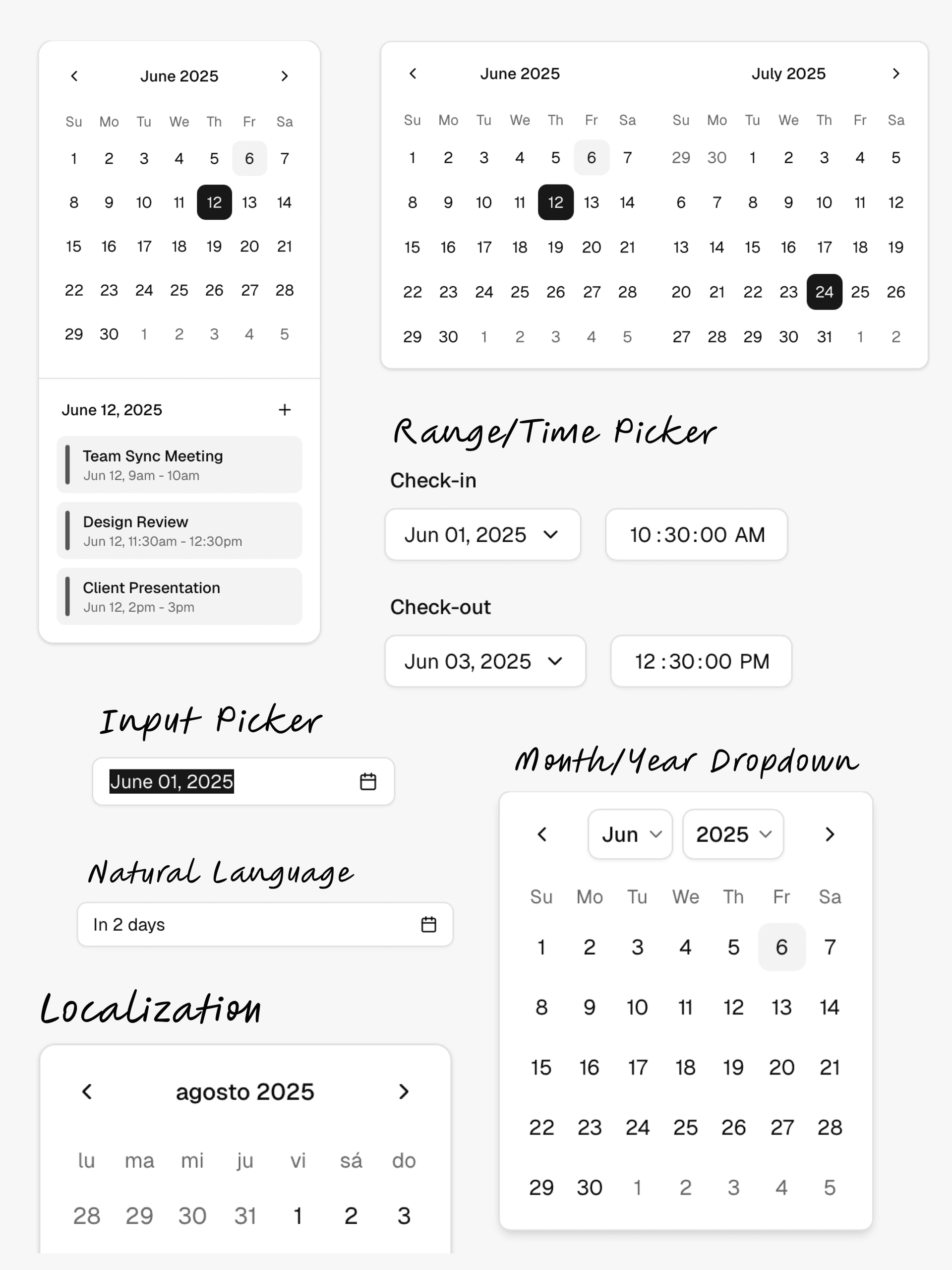
To upgrade your project to the latest version of the Calendar component, see the upgrade guide.
May 2025 - New Site
We've upgraded ui.shadcn.com to Next.js 15.3 and Tailwind v4. The site now uses the upgraded new-york components.
We've also made some minor design updates to make the site faster and easier to navigate.
This upgrade unlocks a lot of new features that we're working on. More to come.
April 2025 - MCP
We're working on zero-config MCP support for shadcn/ui registry. One command npx shadcn registry:mcp to make any registry mcp-compatible.
Learn more in the thread here.
March 2025 - shadcn 2.5.0
We tagged shadcn 2.5.0 earlier this week. It comes with a pretty cool feature: resolve anywhere.
Registries can now place files anywhere in an app and we'll properly resolve imports. No need to stick to a fixed file structure. It can even add files outside the registry itself.
On install, we track all files and perform a multi-pass resolution to correctly handle imports and aliases. It's fast.
March 2025 - Cross-framework Route Support
The shadcn CLI can now auto-detect your framework and adapts routes for you.
Works with all frameworks including Laravel, Vite and React Router.
February 2025 - Tailwind v4
We shipped the first preview of Tailwind v4 and React 19. Ready for you to try out. You can start using it today.
What's New:
- The CLI can now initialize projects with Tailwind v4.
- Full support for the new @theme directive and @theme inline option.
- All components are updated for Tailwind v4 and React 19.
- We've removed the forwardRefs and adjusted the types.
- Every primitive now has a data-slot attribute for styling.
- We've fixed and cleaned up the style of the components.
- We're deprecating the toast component in favor of sonner.
- Buttons now use the default cursor.
- We're deprecating the default style. New projects will use new-york.
- HSL colors are now converted to OKLCH.
Read more in the docs.
February 2025 - Updated Registry Schema
We're updating the registry schema to support more features.
Define code as a flat JSON file and distribute it via the CLI.
- Custom styles: bring your own design system, components & tokens
- Extend, override, mix & match components from third-party registries and LLMs
- Install themes, CSS vars, hooks, animations, and Tailwind layers & utilities
January 2025 - Blocks
We are inviting the community to contribute to the blocks library. Share your components and blocks with other developers and help build a library of high-quality, reusable components.
We'd love to see all types of blocks: applications, marketing, products, and more.
See the docs page to get started.
December 2024 - Monorepo Support
Until now, using shadcn/ui in a monorepo was a bit of a pain. You could add components using the CLI, but you had to manage where the components were installed and manually fix import paths.
With the new monorepo support in the CLI, we've made it a lot easier to use shadcn/ui in a monorepo.
The CLI now understands the monorepo structure and will install the components, dependencies and registry dependencies to the correct paths and handle imports for you.
Read more in the docs.
November 2024 - Icons
An update on icons. The new-york style now uses Lucide as the default icon set.
- New projects will use Lucide by default
- No breaking changes for existing projects
- Use the CLI to (optionally) migrate primitives to Lucide
For more info on why we're doing this, see the thread.
October 2024 - React 19
shadcn/ui is now compatible with React 19 and Next.js 15.
We published a guide to help you upgrade your project to React 19.
Read more here.
October 2024 - Sidebar
Introducing sidebar.tsx: 25 components to help you build all kinds of sidebars.
I don't like building sidebars. So I built 30+ of them. All types. Then simplified the core into sidebar.tsx: a strong foundation to build on top of.
It works with Next.js, Remix, Vite & Laravel.
See the announcement here.
August 2024 - npx shadcn init
The new CLI is now available. It's a complete rewrite with a lot of new features and improvements. You can now install components, themes, hooks, utils and more using npx shadcn add.
This is a major step towards distributing code that you and your LLMs can access and use.
- First up, the cli now has support for all major React framework out of the box. Next.js, Remix, Vite and Laravel. And when you init into a new app, we update your existing Tailwind files instead of overriding.
- A component now ship its own dependencies. Take the accordion for example, it can define its Tailwind keyframes. When you add it to your project, we'll update your tailwind.config.ts file accordingly.
- You can also install remote components using url.
npx shadcn add https://acme.com/registry/navbar.json. - We have also improve the init command. It does framework detection and can even init a brand new Next.js app in one command.
npx shadcn init. - We have created a new schema that you can use to ship your own component registry. And since it has support for urls, you can even use it to distribute private components.
- And a few more updates like better error handling and monorepo support.
You can try the new cli today.
Update Your Project
To update an existing project to use the new CLI, update your components.json file to include import aliases for your components, utils, ui, lib and hooks.
{
"$schema": "https://ui.shadcn.com/schema.json",
"style": "new-york",
"tailwind": {
// ...
},
"aliases": {
"components": "@/components",
"utils": "@/lib/utils",
"ui": "@/components/ui",
"lib": "@/lib",
"hooks": "@/hooks"
}
}If you're using a different import alias prefix eg ~, replace @ with your prefix.
April 2024 - Introducing Lift Mode
We're introducing a new mode for Blocks called Lift Mode.
Enable Lift Mode to automatically "lift" smaller components from a block template for copy and paste.
 View the blocks library
With Lift Mode, you'll be able to copy the smaller components that make up a block template, like cards, buttons, and forms, and paste them directly into your project.
Visit the Blocks page to try it out.
March 2024 - Introducing Blocks
One of the most requested features since launch has been layouts: admin dashboards with sidebar, marketing page sections, cards and more.
Today, we're launching Blocks.
 View the blocks library
Blocks are ready-made components that you can use to build your apps. They are fully responsive, accessible, and composable, meaning they are built using the same principles as the rest of the components in shadcn/ui.
We're starting with dashboard layouts and authentication pages, with plans to add more blocks in the coming weeks.
Open Source
Blocks are open source. You can find the source on GitHub. Use them in your projects, customize them and contribute back.
 View the blocks library
Request a Block
We're also introducing a "Request a Block" feature. If there's a specific block you'd like to see, simply create a request on GitHub and the community can upvote and build it.
 View the blocks library
v0
If you have a v0 account, you can use the Edit in v0 feature to open the code on v0 for prompting and further generation.
That's it. Looking forward to seeing what you build with Blocks.
March 2024 - Breadcrumb and Input OTP
We've added a new Breadcrumb component and an Input OTP component.
Breadcrumb
An accessible and flexible breadcrumb component. It has support for collapsed items, custom separators, bring-your-own routing <Link /> and composable with other shadcn/ui components.
import Link from "next/link"

import {
  Breadcrumb,
  BreadcrumbEllipsis,
  BreadcrumbItem,
  BreadcrumbLink,
  BreadcrumbList,
  BreadcrumbPage,
  BreadcrumbSeparator,
} from "@/components/ui/breadcrumb"
import {
  DropdownMenu,
  DropdownMenuContent,
  DropdownMenuItem,
  DropdownMenuTrigger,
} from "@/components/ui/dropdown-menu"

export function BreadcrumbDemo() {
  return (
    <Breadcrumb>
      <BreadcrumbList>
        <BreadcrumbItem>
          <BreadcrumbLink asChild>
            <Link href="/">Home</Link>
          </BreadcrumbLink>
        </BreadcrumbItem>
        <BreadcrumbSeparator />
        <BreadcrumbItem>
          <DropdownMenu>
            <DropdownMenuTrigger className="flex items-center gap-1">
              <BreadcrumbEllipsis className="size-4" />
              <span className="sr-only">Toggle menu</span>
            </DropdownMenuTrigger>
            <DropdownMenuContent align="start">
              <DropdownMenuItem>Documentation</DropdownMenuItem>
              <DropdownMenuItem>Themes</DropdownMenuItem>
              <DropdownMenuItem>GitHub</DropdownMenuItem>
            </DropdownMenuContent>
          </DropdownMenu>
        </BreadcrumbItem>
        <BreadcrumbSeparator />
        <BreadcrumbItem>
          <BreadcrumbLink asChild>
            <Link href="/docs/components">Components</Link>
          </BreadcrumbLink>
        </BreadcrumbItem>
        <BreadcrumbSeparator />
        <BreadcrumbItem>
          <BreadcrumbPage>Breadcrumb</BreadcrumbPage>
        </BreadcrumbItem>
      </BreadcrumbList>
    </Breadcrumb>
  )
}
Input OTP
A fully featured input OTP component. It has support for numeric and alphanumeric codes, custom length, copy-paste and accessible. Input OTP is built on top of input-otp by @guilherme_rodz.
import {
  InputOTP,
  InputOTPGroup,
  InputOTPSeparator,
  InputOTPSlot,
} from "@/components/ui/input-otp"

export function InputOTPDemo() {
  return (
    <InputOTP maxLength={6}>
      <InputOTPGroup>
        <InputOTPSlot index={0} />
        <InputOTPSlot index={1} />
        <InputOTPSlot index={2} />
      </InputOTPGroup>
      <InputOTPSeparator />
      <InputOTPGroup>
        <InputOTPSlot index={3} />
        <InputOTPSlot index={4} />
        <InputOTPSlot index={5} />
      </InputOTPGroup>
    </InputOTP>
  )
}
If you have a v0, the new components are available for generation.
December 2023 - New components, CLI and more
We've added new components to shadcn/ui and made a lot of improvements to the CLI.
Here's a quick overview of what's new:
- Carousel - A carousel component with motion, swipe gestures and keyboard support.
- Drawer - A drawer component that looks amazing on mobile.
- Pagination - A pagination component with page navigation, previous and next buttons.
- Resizable - A resizable component for building resizable panel groups and layouts.
- Sonner - The last toast component you'll ever need.
- CLI updates - Support for custom Tailwind prefix and
tailwind.config.ts.
Carousel
We've added a fully featured carousel component with motion, swipe gestures and keyboard support. Built on top of Embla Carousel.
It has support for infinite looping, autoplay, vertical orientation, and more.
import * as React from "react"

import { Card, CardContent } from "@/components/ui/card"
import {
  Carousel,
  CarouselContent,
  CarouselItem,
  CarouselNext,
  CarouselPrevious,
} from "@/components/ui/carousel"

export function CarouselDemo() {
  return (
    <Carousel className="w-full max-w-xs">
      <CarouselContent>
        {Array.from({ length: 5 }).map((_, index) => (
          <CarouselItem key={index}>
            <div className="p-1">
              <Card>
                <CardContent className="flex aspect-square items-center justify-center p-6">
                  <span className="text-4xl font-semibold">{index + 1}</span>
                </CardContent>
              </Card>
            </div>
          </CarouselItem>
        ))}
      </CarouselContent>
      <CarouselPrevious />
      <CarouselNext />
    </Carousel>
  )
}
Drawer
Oh the drawer component 😍. Built on top of Vaul by emilkowalski_.
Try opening the following drawer on mobile. It looks amazing!
"use client"

import * as React from "react"
import { Minus, Plus } from "lucide-react"
import { Bar, BarChart, ResponsiveContainer } from "recharts"

import { Button } from "@/components/ui/button"
import {
  Drawer,
  DrawerClose,
  DrawerContent,
  DrawerDescription,
  DrawerFooter,
  DrawerHeader,
  DrawerTitle,
  DrawerTrigger,
} from "@/components/ui/drawer"

const data = [
  {
    goal: 400,
  },
  {
    goal: 300,
  },
  {
    goal: 200,
  },
  {
    goal: 300,
  },
  {
    goal: 200,
  },
  {
    goal: 278,
  },
  {
    goal: 189,
  },
  {
    goal: 239,
  },
  {
    goal: 300,
  },
  {
    goal: 200,
  },
  {
    goal: 278,
  },
  {
    goal: 189,
  },
  {
    goal: 349,
  },
]

export function DrawerDemo() {
  const [goal, setGoal] = React.useState(350)

  function onClick(adjustment: number) {
    setGoal(Math.max(200, Math.min(400, goal + adjustment)))
  }

  return (
    <Drawer>
      <DrawerTrigger asChild>
        <Button variant="outline">Open Drawer</Button>
      </DrawerTrigger>
      <DrawerContent>
        <div className="mx-auto w-full max-w-sm">
          <DrawerHeader>
            <DrawerTitle>Move Goal</DrawerTitle>
            <DrawerDescription>Set your daily activity goal.</DrawerDescription>
          </DrawerHeader>
          <div className="p-4 pb-0">
            <div className="flex items-center justify-center space-x-2">
              <Button
                variant="outline"
                size="icon"
                className="h-8 w-8 shrink-0 rounded-full"
                onClick={() => onClick(-10)}
                disabled={goal <= 200}
              >
                <Minus />
                <span className="sr-only">Decrease</span>
              </Button>
              <div className="flex-1 text-center">
                <div className="text-7xl font-bold tracking-tighter">
                  {goal}
                </div>
                <div className="text-muted-foreground text-[0.70rem] uppercase">
                  Calories/day
                </div>
              </div>
              <Button
                variant="outline"
                size="icon"
                className="h-8 w-8 shrink-0 rounded-full"
                onClick={() => onClick(10)}
                disabled={goal >= 400}
              >
                <Plus />
                <span className="sr-only">Increase</span>
              </Button>
            </div>
            <div className="mt-3 h-[120px]">
              <ResponsiveContainer width="100%" height="100%">
                <BarChart data={data}>
                  <Bar
                    dataKey="goal"
                    style={
                      {
                        fill: "hsl(var(--foreground))",
                        opacity: 0.9,
                      } as React.CSSProperties
                    }
                  />
                </BarChart>
              </ResponsiveContainer>
            </div>
          </div>
          <DrawerFooter>
            <Button>Submit</Button>
            <DrawerClose asChild>
              <Button variant="outline">Cancel</Button>
            </DrawerClose>
          </DrawerFooter>
        </div>
      </DrawerContent>
    </Drawer>
  )
}
Pagination
We've added a pagination component with page navigation, previous and next buttons. Simple, flexible and works with your framework's <Link /> component.
import {
  Pagination,
  PaginationContent,
  PaginationEllipsis,
  PaginationItem,
  PaginationLink,
  PaginationNext,
  PaginationPrevious,
} from "@/components/ui/pagination"

export function PaginationDemo() {
  return (
    <Pagination>
      <PaginationContent>
        <PaginationItem>
          <PaginationPrevious href="#" />
        </PaginationItem>
        <PaginationItem>
          <PaginationLink href="#">1</PaginationLink>
        </PaginationItem>
        <PaginationItem>
          <PaginationLink href="#" isActive>
            2
          </PaginationLink>
        </PaginationItem>
        <PaginationItem>
          <PaginationLink href="#">3</PaginationLink>
        </PaginationItem>
        <PaginationItem>
          <PaginationEllipsis />
        </PaginationItem>
        <PaginationItem>
          <PaginationNext href="#" />
        </PaginationItem>
      </PaginationContent>
    </Pagination>
  )
}
Resizable
Build resizable panel groups and layouts with this <Resizable /> component.
import {
  ResizableHandle,
  ResizablePanel,
  ResizablePanelGroup,
} from "@/components/ui/resizable"

export function ResizableDemo() {
  return (
    <ResizablePanelGroup
      direction="horizontal"
      className="max-w-md rounded-lg border md:min-w-[450px]"
    >
      <ResizablePanel defaultSize={50}>
        <div className="flex h-[200px] items-center justify-center p-6">
          <span className="font-semibold">One</span>
        </div>
      </ResizablePanel>
      <ResizableHandle withHandle />
      <ResizablePanel defaultSize={50}>
        <ResizablePanelGroup direction="vertical">
          <ResizablePanel defaultSize={25}>
            <div className="flex h-full items-center justify-center p-6">
              <span className="font-semibold">Two</span>
            </div>
          </ResizablePanel>
          <ResizableHandle withHandle />
          <ResizablePanel defaultSize={75}>
            <div className="flex h-full items-center justify-center p-6">
              <span className="font-semibold">Three</span>
            </div>
          </ResizablePanel>
        </ResizablePanelGroup>
      </ResizablePanel>
    </ResizablePanelGroup>
  )
}
<Resizable /> is built using react-resizable-panels by bvaughn. It has support for mouse, touch and keyboard.
Sonner
Another one by emilkowalski_. The last toast component you'll ever need. Sonner is now availabe in shadcn/ui.
"use client"

import { toast } from "sonner"

import { Button } from "@/components/ui/button"

export function SonnerDemo() {
  return (
    <Button
      variant="outline"
      onClick={() =>
        toast("Event has been created", {
          description: "Sunday, December 03, 2023 at 9:00 AM",
          action: {
            label: "Undo",
            onClick: () => console.log("Undo"),
          },
        })
      }
    >
      Show Toast
    </Button>
  )
}
CLI updates
This has been one of the most requested features. You can now configure a custom Tailwind prefix and the cli will automatically prefix your utility classes when adding components.
This means you can now easily add shadcn/ui components to existing projects like Docusaurus, Nextra...etc. A drop-in for your existing design system with no conflict. 🔥
<AlertDialog className="tw-grid tw-gap-4 tw-border tw-bg-background tw-shadow-lg" />It works with cn, cva and CSS variables.
The cli can now also detect tailwind.config.ts and add the TypeScript version of the config for you.
That's it. Happy Holidays.
July 2023 - JavaScript
This project and the components are written in TypeScript. We recommend using TypeScript for your project as well.
However we provide a JavaScript version of the components, available via the cli.
Would you like to use TypeScript (recommended)? noTo opt-out of TypeScript, you can use the tsx flag in your components.json file.
{
"style": "default",
"tailwind": {
"config": "tailwind.config.js",
"css": "src/app/globals.css",
"baseColor": "zinc",
"cssVariables": true
},
"rsc": false,
"tsx": false,
"aliases": {
"utils": "~/lib/utils",
"components": "~/components"
}
}To configure import aliases, you can use the following jsconfig.json:
{
"compilerOptions": {
"paths": {
"@/*": ["./*"]
}
}
}June 2023 - New CLI, Styles and more
I have a lot of updates to share with you today:
- New CLI - Rewrote the CLI from scratch. You can now add components, dependencies and configure import paths.
- Theming - Choose between using CSS variables or Tailwind CSS utility classes for theming.
- Base color - Configure the base color for your project. This will be used to generate the default color palette for your components.
- React Server Components - Opt out of using React Server Components. The CLI will automatically append or remove the
use clientdirective. - Styles - Introducing a new concept called Style. A style comes with its own set of components, animations, icons and more.
- Exit animations - Added exit animations to all components.
- Other updates - New
iconbutton size, updatedsheetcomponent and more. - Updating your project - How to update your project to get the latest changes.
New CLI
I've been working on a new CLI for the past few weeks. It's a complete rewrite. It comes with a lot of new features and improvements.
init
When you run the init command, you will be asked a few questions to configure components.json:
Which style would you like to use? › Default
Which color would you like to use as base color? › Slate
Where is your global CSS file? › › app/globals.css
Do you want to use CSS variables for colors? › no / yes
Where is your tailwind.config.js located? › tailwind.config.js
Configure the import alias for components: › @/components
Configure the import alias for utils: › @/lib/utils
Are you using React Server Components? › no / yesThis file contains all the information about your components: where to install them, the import paths, how they are styled...etc.
You can use this file to change the import path of a component, set a baseColor or change the styling method.
{
"style": "default",
"tailwind": {
"config": "tailwind.config.ts",
"css": "src/app/globals.css",
"baseColor": "zinc",
"cssVariables": true
},
"rsc": false,
"aliases": {
"utils": "~/lib/utils",
"components": "~/components"
}
}This means you can now use the CLI with any directory structure including src and app directories.
add
The add command is now much more capable. You can now add UI components but also import more complex components (coming soon).
The CLI will automatically resolve all components and dependencies, format them based on your custom config and add them to your project.
diff (experimental)
We're also introducing a new diff command to help you keep track of upstream updates.
You can use this command to see what has changed in the upstream repository and update your project accordingly.
Run the diff command to get a list of components that have updates available:
The following components have updates available:
- button
- /path/to/my-app/components/ui/button.tsx
- toast
- /path/to/my-app/components/ui/use-toast.ts
- /path/to/my-app/components/ui/toaster.tsxThen run diff [component] to see the changes:
const alertVariants = cva(
- "relative w-full rounded-lg border",
+ "relative w-full pl-12 rounded-lg border"
)Theming with CSS Variables or Tailwind Colors
You can choose between using CSS variables or Tailwind CSS utility classes for theming.
When you add new components, the CLI will automatically use the correct theming methods based on your components.json configuration.
Utility classes
<div className="bg-zinc-950 dark:bg-white" />To use utility classes for theming set tailwind.cssVariables to false in your components.json file.
{
"tailwind": {
"config": "tailwind.config.js",
"css": "app/globals.css",
"baseColor": "slate",
"cssVariables": false
}
}CSS Variables
<div className="bg-background text-foreground" />To use CSS variables classes for theming set tailwind.cssVariables to true in your components.json file.
{
"tailwind": {
"config": "tailwind.config.js",
"css": "app/globals.css",
"baseColor": "slate",
"cssVariables": true
}
}Base color
You can now configure the base color for your project. This will be used to generate the default color palette for your components.
{
"tailwind": {
"config": "tailwind.config.js",
"css": "app/globals.css",
"baseColor": "zinc",
"cssVariables": false
}
}Choose between gray, neutral, slate, stone or zinc.
If you have cssVariables set to true, we will set the base colors as CSS variables in your globals.css file. If you have cssVariables set to false, we will inline the Tailwind CSS utility classes in your components.
React Server Components
If you're using a framework that does not support React Server Components, you can now opt out by setting rsc to false. We will automatically append or remove the use client directive when adding components.
{
"rsc": false
}Styles
We are introducing a new concept called Style.
You can think of style as the visual foundation: shapes, icons, animations & typography. A style comes with its own set of components, animations, icons and more.
We are shipping two styles: default and new-york (with more coming soon).
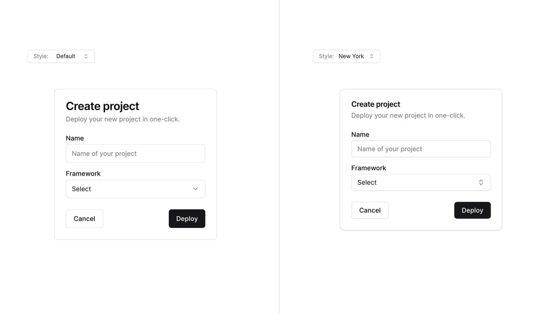
The default style is the one you are used to. It's the one we've been using since the beginning of this project. It uses lucide-react for icons and tailwindcss-animate for animations.
The new-york style is a new style. It ships with smaller buttons, cards with shadows and a new set of icons from Radix Icons.
When you run the init command, you will be asked which style you would like to use. This is saved in your components.json file.
{
"style": "new-york"
}Theming
Start with a style as the base then theme using CSS variables or Tailwind CSS utility classes to completely change the look of your components.
Exit animations
I added exit animations to all components. Click on the combobox below to see the subtle exit animation.
"use client"

import * as React from "react"
import { Check, ChevronsUpDown } from "lucide-react"

import { cn } from "@/lib/utils"
import { Button } from "@/components/ui/button"
import {
  Command,
  CommandEmpty,
  CommandGroup,
  CommandInput,
  CommandItem,
  CommandList,
} from "@/components/ui/command"
import {
  Popover,
  PopoverContent,
  PopoverTrigger,
} from "@/components/ui/popover"

const frameworks = [
  {
    value: "next.js",
    label: "Next.js",
  },
  {
    value: "sveltekit",
    label: "SvelteKit",
  },
  {
    value: "nuxt.js",
    label: "Nuxt.js",
  },
  {
    value: "remix",
    label: "Remix",
  },
  {
    value: "astro",
    label: "Astro",
  },
]

export function ComboboxDemo() {
  const [open, setOpen] = React.useState(false)
  const [value, setValue] = React.useState("")

  return (
    <Popover open={open} onOpenChange={setOpen}>
      <PopoverTrigger asChild>
        <Button
          variant="outline"
          role="combobox"
          aria-expanded={open}
          className="w-[200px] justify-between"
        >
          {value
            ? frameworks.find((framework) => framework.value === value)?.label
            : "Select framework..."}
          <ChevronsUpDown className="opacity-50" />
        </Button>
      </PopoverTrigger>
      <PopoverContent className="w-[200px] p-0">
        <Command>
          <CommandInput placeholder="Search framework..." className="h-9" />
          <CommandList>
            <CommandEmpty>No framework found.</CommandEmpty>
            <CommandGroup>
              {frameworks.map((framework) => (
                <CommandItem
                  key={framework.value}
                  value={framework.value}
                  onSelect={(currentValue) => {
                    setValue(currentValue === value ? "" : currentValue)
                    setOpen(false)
                  }}
                >
                  {framework.label}
                  <Check
                    className={cn(
                      "ml-auto",
                      value === framework.value ? "opacity-100" : "opacity-0"
                    )}
                  />
                </CommandItem>
              ))}
            </CommandGroup>
          </CommandList>
        </Command>
      </PopoverContent>
    </Popover>
  )
}
The animations can be customized using utility classes.
Other updates
Button
- Added a new button size
icon:
import { CircleFadingArrowUpIcon } from "lucide-react"

import { Button } from "@/components/ui/button"

export function ButtonIcon() {
  return (
    <Button variant="outline" size="icon">
      <CircleFadingArrowUpIcon />
    </Button>
  )
}
Sheet
- Renamed
positiontosideto match the other elements.
"use client"
import { Button } from "@/components/ui/button"
import { Input } from "@/components/ui/input"
import { Label } from "@/components/ui/label"
import {
Sheet,
SheetClose,
SheetContent,
SheetDescription,
SheetFooter,
SheetHeader,
SheetTitle,
SheetTrigger,
} from "@/components/ui/sheet"
const SHEET_SIDES = ["top", "right", "bottom", "left"] as const
type SheetSide = (typeof SHEET_SIDES)[number]
export function SheetSide() {
return (
<div className="grid grid-cols-2 gap-2">
{SHEET_SIDES.map((side) => (
<Sheet key={side}>
<SheetTrigger asChild>
<Button variant="outline">{side}</Button>
</SheetTrigger>
<SheetContent side={side}>
<SheetHeader>
<SheetTitle>Edit profile</SheetTitle>
<SheetDescription>
Make changes to your profile here. Click save when you're
done.
</SheetDescription>
</SheetHeader>
<div className="grid gap-4 py-4">
<div className="grid grid-cols-4 items-center gap-4">
<Label htmlFor="name" className="text-right">
Name
</Label>
<Input id="name" value="Pedro Duarte" className="col-span-3" />
</div>
<div className="grid grid-cols-4 items-center gap-4">
<Label htmlFor="username" className="text-right">
Username
</Label>
<Input id="username" value="@peduarte" className="col-span-3" />
</div>
</div>
<SheetFooter>
<SheetClose asChild>
<Button type="submit">Save changes</Button>
</SheetClose>
</SheetFooter>
</SheetContent>
</Sheet>
))}
</div>
)
}
- Removed the
sizeprops. UseclassName="w-[200px] md:w-[450px]"for responsive sizing.
Updating your project
Since we follow a copy and paste approach, you will need to manually update your project to get the latest changes.
Note: we are working on a diff command to help you
keep track of upstream updates.
Add components.json
Creating a components.json file at the root:
{
"style": "default",
"rsc": true,
"tailwind": {
"config": "tailwind.config.js",
"css": "app/globals.css",
"baseColor": "slate",
"cssVariables": true
},
"aliases": {
"components": "@/components",
"utils": "@/lib/utils"
}
}Update the values for tailwind.css and aliases to match your project structure.
Button
Add the icon size to the buttonVariants:
const buttonVariants = cva({
variants: {
size: {
default: "h-10 px-4 py-2",
sm: "h-9 rounded-md px-3",
lg: "h-11 rounded-md px-8",
icon: "h-10 w-10",
},
},
})Sheet
- Replace the content of
sheet.tsxwith the following:
"use client"
import * as React from "react"
import * as SheetPrimitive from "@radix-ui/react-dialog"
import { cva, type VariantProps } from "class-variance-authority"
import { X } from "lucide-react"
import { cn } from "@/lib/utils"
const Sheet = SheetPrimitive.Root
const SheetTrigger = SheetPrimitive.Trigger
const SheetClose = SheetPrimitive.Close
const SheetPortal = ({
className,
...props
}: SheetPrimitive.DialogPortalProps) => (
<SheetPrimitive.Portal className={cn(className)} {...props} />
)
SheetPortal.displayName = SheetPrimitive.Portal.displayName
const SheetOverlay = React.forwardRef<
React.ElementRef<typeof SheetPrimitive.Overlay>,
React.ComponentPropsWithoutRef<typeof SheetPrimitive.Overlay>
>(({ className, ...props }, ref) => (
<SheetPrimitive.Overlay
className={cn(
"bg-background/80 data-[state=open]:animate-in data-[state=closed]:animate-out data-[state=closed]:fade-out-0 data-[state=open]:fade-in-0 fixed inset-0 z-50 backdrop-blur-sm",
className
)}
{...props}
ref={ref}
/>
))
SheetOverlay.displayName = SheetPrimitive.Overlay.displayName
const sheetVariants = cva(
"fixed z-50 gap-4 bg-background p-6 shadow-lg transition ease-in-out data-[state=open]:animate-in data-[state=closed]:animate-out data-[state=closed]:duration-300 data-[state=open]:duration-500",
{
variants: {
side: {
top: "inset-x-0 top-0 border-b data-[state=closed]:slide-out-to-top data-[state=open]:slide-in-from-top",
bottom:
"inset-x-0 bottom-0 border-t data-[state=closed]:slide-out-to-bottom data-[state=open]:slide-in-from-bottom",
left: "inset-y-0 left-0 h-full w-3/4 border-r data-[state=closed]:slide-out-to-left data-[state=open]:slide-in-from-left sm:max-w-sm",
right:
"inset-y-0 right-0 h-full w-3/4 border-l data-[state=closed]:slide-out-to-right data-[state=open]:slide-in-from-right sm:max-w-sm",
},
},
defaultVariants: {
side: "right",
},
}
)
interface SheetContentProps
extends React.ComponentPropsWithoutRef<typeof SheetPrimitive.Content>,
VariantProps<typeof sheetVariants> {}
const SheetContent = React.forwardRef<
React.ElementRef<typeof SheetPrimitive.Content>,
SheetContentProps
>(({ side = "right", className, children, ...props }, ref) => (
<SheetPortal>
<SheetOverlay />
<SheetPrimitive.Content
ref={ref}
className={cn(sheetVariants({ side }), className)}
{...props}
>
{children}
<SheetPrimitive.Close className="ring-offset-background focus:ring-ring data-[state=open]:bg-secondary absolute top-4 right-4 rounded-sm opacity-70 transition-opacity hover:opacity-100 focus:ring-2 focus:ring-offset-2 focus:outline-none disabled:pointer-events-none">
<X className="h-4 w-4" />
<span className="sr-only">Close</span>
</SheetPrimitive.Close>
</SheetPrimitive.Content>
</SheetPortal>
))
SheetContent.displayName = SheetPrimitive.Content.displayName
const SheetHeader = ({
className,
...props
}: React.HTMLAttributes<HTMLDivElement>) => (
<div
className={cn(
"flex flex-col space-y-2 text-center sm:text-left",
className
)}
{...props}
/>
)
SheetHeader.displayName = "SheetHeader"
const SheetFooter = ({
className,
...props
}: React.HTMLAttributes<HTMLDivElement>) => (
<div
className={cn(
"flex flex-col-reverse sm:flex-row sm:justify-end sm:space-x-2",
className
)}
{...props}
/>
)
SheetFooter.displayName = "SheetFooter"
const SheetTitle = React.forwardRef<
React.ElementRef<typeof SheetPrimitive.Title>,
React.ComponentPropsWithoutRef<typeof SheetPrimitive.Title>
>(({ className, ...props }, ref) => (
<SheetPrimitive.Title
ref={ref}
className={cn("text-foreground text-lg font-semibold", className)}
{...props}
/>
))
SheetTitle.displayName = SheetPrimitive.Title.displayName
const SheetDescription = React.forwardRef<
React.ElementRef<typeof SheetPrimitive.Description>,
React.ComponentPropsWithoutRef<typeof SheetPrimitive.Description>
>(({ className, ...props }, ref) => (
<SheetPrimitive.Description
ref={ref}
className={cn("text-muted-foreground text-sm", className)}
{...props}
/>
))
SheetDescription.displayName = SheetPrimitive.Description.displayName
export {
Sheet,
SheetTrigger,
SheetClose,
SheetContent,
SheetHeader,
SheetFooter,
SheetTitle,
SheetDescription,
}- Rename
positiontoside
- <Sheet position="right" />
+ <Sheet side="right" />Thank you
I'd like to thank everyone who has been using this project, providing feedback and contributing to it. I really appreciate it. Thank you 🙏